Why Are Landing Pages So Important?
A landing page isn’t just a page on your website, it’s a decision environment. When someone lands on it, they’re subconsciously asking: Is this relevant to me? Can I trust this? Is this worth it? What happens if I click?
High-converting landing pages are designed around answering those questions clearly and confidently. Let's talk about how psychology, clarity, and momentum affect a user's desire to stay on your website.

Helping people answer questions on your landing page is so important!
Start With Intent, Not Aesthetic
Before designing anything, you need to understand why someone is landing on this page. Are they coming from a Google search? An Instagram ad? A referral link? Different traffic sources mean different expectations. Someone clicking a paid ad expects a direct continuation of the promise they just saw. If your landing page shifts tone or message, it creates friction. That friction reduces trust, and trust is directly tied to conversion.
Design decisions should support intent. The headline should reflect the exact promise that brought them there. The visuals should reinforce the outcome they’re hoping for. When the experience feels cohesive, users move forward more confidently.
Make the Value Proposition Instantly Clear
Within the first few seconds, users should understand three things:
- What this is
- Who it's for
- Why it matters
If they have to scroll to figure that out, you're already losing conversions.
Strong landing pages lead with outcomes, not features. Instead of listing what your product or service includes, clarify the transformation. People don’t buy “a 12-week coaching program.” They buy clarity, growth, confidence, or revenue. When your value proposition reflects the end result, it connects more powerfully.
Reduce Cognitive Load
Every decision requires mental energy. The more thinking your page demands, the more likely users are to leave. This is where layout matters deeply. Too many font styles, competing colors, long paragraphs without breaks, or excessive animation all increase cognitive load. Simplicity increases comprehension.
Even your form design plays a role. Research consistently shows that fewer fields increase submissions. If you only truly need a name and email, asking for a phone number introduces unnecessary resistance. Each additional requirement should justify its existence.
Build Trust Before You Ask for Action
One of the biggest conversion mistakes is asking for commitment before building confidence. Before someone books a call or makes a purchase, they need reassurance. That reassurance can come in several forms:
- Testimonials that feel specific and believable
- A short explanation of your process
- Clear pricing or at least transparent expectations
- Social proof (logos, case studies, measurable outcomes)
Trust reduces perceived risk. And lowering perceived risk is one of the strongest drivers of conversion.

Always planning before making design decisions.
Address Objections Proactively
Every visitor has internal objections. They may not say them out loud, but they’re there. “Is this worth the money?” “Will this work for my situation?” “What if it doesn’t?”
High-converting landing pages answer these concerns front and center. A brief FAQ section, a money-back guarantee, or even a sentence acknowledging common hesitation can dramatically increase conversions. When users feel understood, they tend to relax.
Use Visual Hierarchy to Create Momentum
A well-designed landing page guides the eye intentionally from headline to supporting copy to proof to call-to-action. Contrast draws attention to buttons. Spacing gives content room to breathe. Section breaks create rhythm, and momentum matters. When a page feels smooth and intentional, users keep scrolling, but when it feels chaotic or overwhelming, they usually disengage.
Repeat (But Don’t Overwhelm) the Call to Action
Even though it's important to place a strong call to action before the user scrolls, most users won’t click the first time they see a button. That’s why strong landing pages place calls to action strategically throughout the page: after explaining benefits, after testimonials, and again at the bottom. Each CTA appears at a natural decision point.

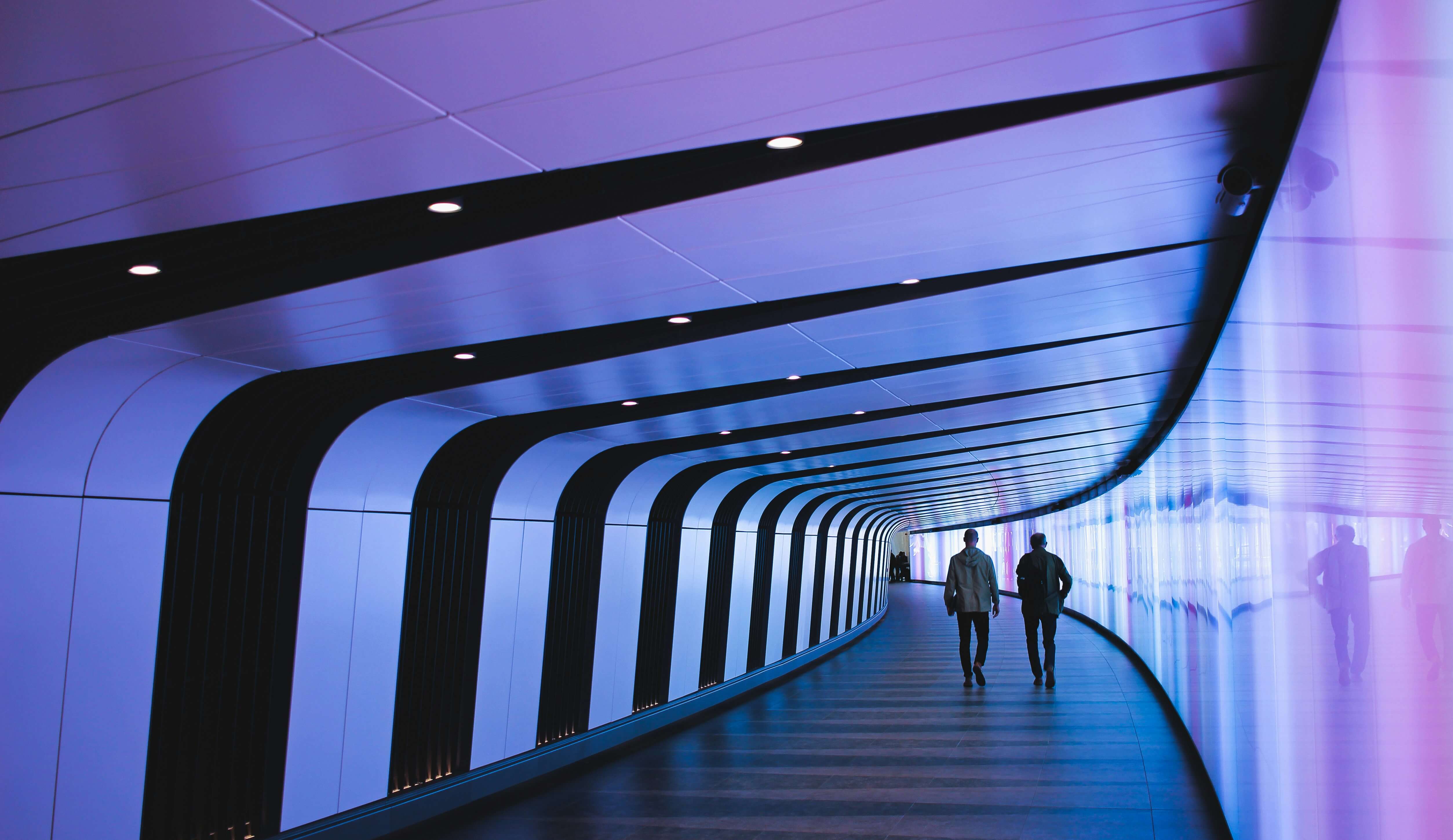
Where will your users go next?
Optimize for Mobile Behavior
Mobile users behave differently than desktop users. They scroll faster. They skim more aggressively. They are often multitasking. For this reason, important information should appear earlier, buttons should be thumb-friendly, forms should be simple, and long walls of text that might work on desktop should be simplified lest they overwhelm mobile users.
Why the Best Landing Pages Feel Effortless
When a landing page converts well, it's usually because the user understands the value. They trust what's being offered, and the next step is clear. That sense of ease is not accidental, it’s the result of intentional UX decisions layered with strategic messaging. When design removes friction and reinforces confidence, conversions increase naturally.
Would you like your landing page to effortlessly perform?
Most of the time, businesses don't need a full redesign. A few small changes are all that's needed, to increase your website's performance. I would be more than happy to have a look!
We offer UX Audits & More